We provide effective and economically affordable training courses for R and Python, Click here for more details and course registration !
Kernel density function is a nonparametric method to find the drawing density curve of random samples, and it is often used to draw a smoothed curve in data visualization. In R programming with ggplot2 package, a chaining of functions ggplot() and geom_density() is often used to draw different smoothed curves showing the distribution of continuous variables. In the ongoing examples, we attempt to illustrate the types of kernel density curves that can be plotted with R.
- draw a simple kernel density curve
A simple kernel density curve with default setting can be simply generated with the statement:
ggplot(df, aes(x = var)) + geom_density()
Where
df is a data frame,
And
var is a continuous belonging to df.
The following example shows the plotting of a kernel density curve of variable ‘cty’ from data frame ‘mpg’.
#draw a simple kernel density curve for veriable 'cty' in #data frame 'mpg'
> library(ggplot2)
> data(mpg)
> ggplot(mpg, aes(x=cty)) +
   geom_density() +
labs(title=" A simple kernel density curve") 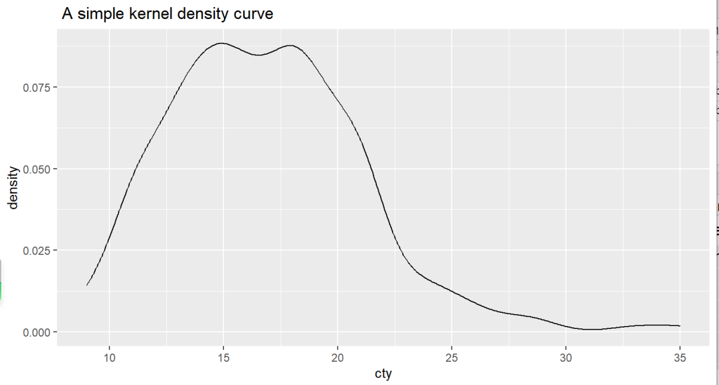
2. And the same kernel density curve can be filled with defined color (red).
#Kernel density curve with filled color red
> ggplot(mpg, aes(x=cty)) +
   geom_density(fill="red") +
   labs(title="Kernel density curve with filled color",
x="MPG") 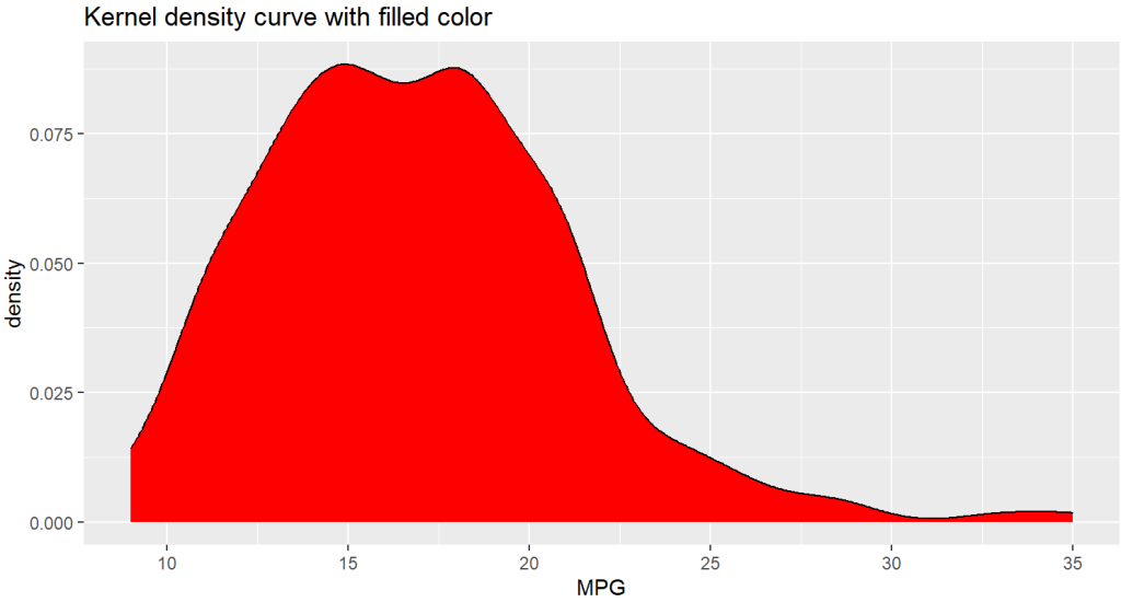
3. Parameter for bandwidth can be adjusted to get a smoother or more jagged curve shape.
#show default bandwidth parameter
> bw.nrd0(mpg$cty)
[1] 1.127884
> #Density plot with smaller bandwidth
> ggplot(mpg, aes(x=cty)) +
   geom_density(fill="red", bw=.8) +
   labs(title="A More jagged Kernel density curve",
     x="MPG")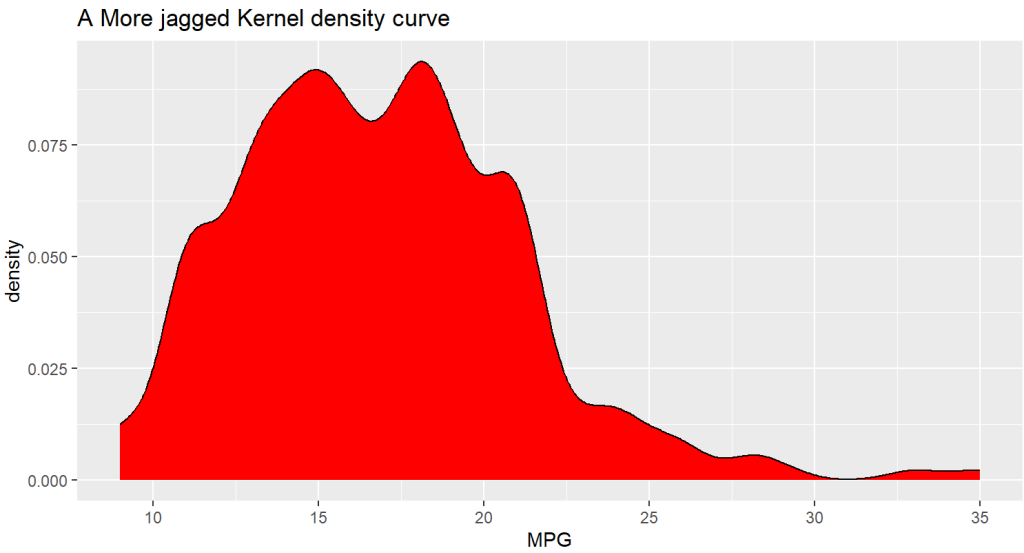
4. Kernel density curves can also be plotted with respect to different values of a categorical variable.
In the following example, kernel density curves for variable ‘cty’ with respect to different levels of variable ‘Cylinders’ are plotted in the same figure.
> data(mpg, package="ggplot2")
> mpg$Cylinders <- factor(mpg$cyl)
#colored density plots for cty, with different levels of
#Cylinders
> ggplot(mpg, aes(x=cty, color=Cylinders, linetype=Cylinders)) +
   geom_density(size=1) +
   labs(title="Kernel density curves by comparison",
      x = "MPG")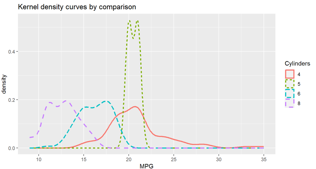
The comparison of different kernel density curves can also be filled with different colors.
#filled density plot for comparison
> ggplot(mpg, aes(x=cty, fill=Cylinders)) +
   geom_density(alpha=.7) +
   labs(title="Filled kernel density curves for comparison",
      x = "MPG")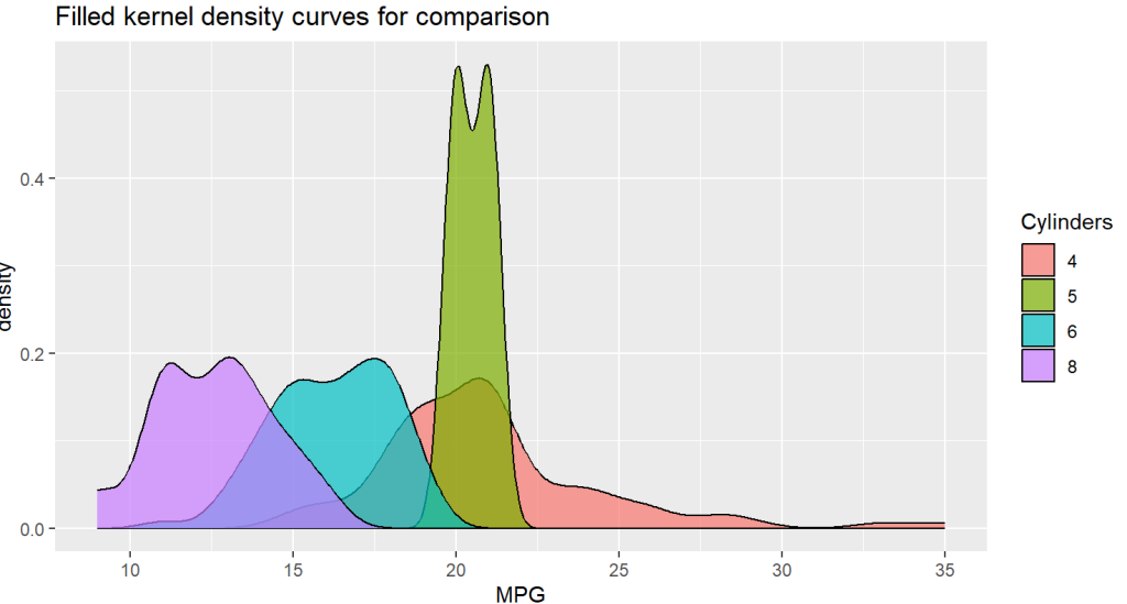
0 Comments